Card
Content containers with flexible layouts for organizing information, enhanced with DaisyUI 5 and Tailwind 4 features
Basic Cards
Simple cards with different content
Card Title
This is a basic card with some content.Product Card
A great product with amazing features.Show Code
Cards with Images
Cards featuring images
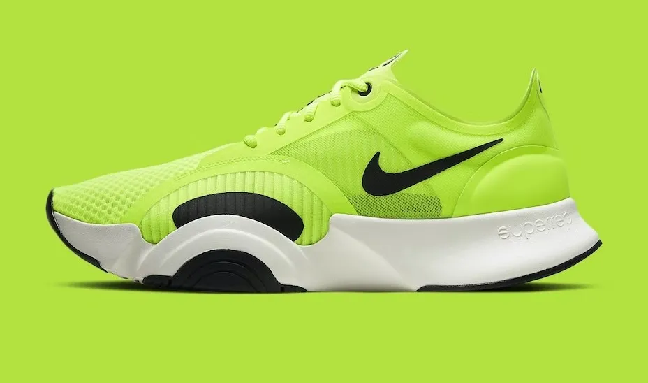
Shoes!
If a dog chews shoes whose shoes does he choose?Show Code
Card with Actions
Card with action buttons at the bottom
Product Card
A great product with amazing features.Show Code
Card Variants
Different card styles and layouts
Compact Card
This is a compact card with less padding.Bordered Card
This card has a border.Glass Card
This card has a glass morphism effect.Show Code
Side Layout Card
Horizontal card layout with side image
Side Card
This card uses a horizontal layout with the image on the side.Show Code
Usage Notes
- Cards are perfect for grouping related content together with enhanced visual hierarchy
- Use card-body class for proper content padding with DaisyUI 5 improvements
- Images should include proper alt text for accessibility and better responsive handling
- Actions prop automatically creates card-actions container with improved spacing
- Side layout works well for horizontal displays with better responsive behavior
- Compact variant reduces padding for dense layouts while maintaining readability
- Glass effect enhanced with better backdrop blur and opacity handling
- Enhanced shadow system with DaisyUI 5 for better depth perception
- Improved border radius system for modern appearance
- Better responsive image behavior within cards
- Enhanced content spacing with improved padding and margin calculations
- Supports Tailwind 4 container queries for responsive design based on card size
- Better theme compatibility with enhanced color tokens
- Improved accessibility with better focus management and ARIA support
- Optimized performance with better CSS generation and reduced bundle impact
- Fully backward compatible - all existing card patterns continue to work